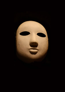


I decided to use the image above because the angle used it not a direct downwards shot; the angle slightly tilts up towards the mask. However I decided to manipulate my photograph in Photoshop to make the background completely black because the font will stand out better. I also wanted a simple but effective poster and I feel that a black background will help achieve this. Here is my photo after it has been manipulated.

I have also re created the font that is used on my trailer to ensure that the title is in the same font throughout all three texts, it is the logo for my film therefore it is important it is always the same and so that it creates a tangible link. I created it on Adobe Photoshop CS3. It is difficult to see the shadow I created on it because it is on a white background; the shadow is only visible when on a dark background.

No comments:
Post a Comment