1.

2.

3.

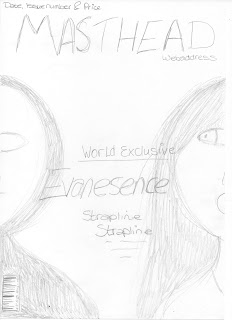
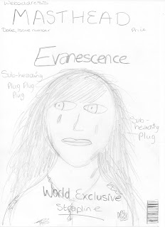
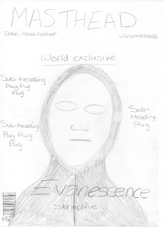
I have decided to opt for draft number one. One of the main conventions of film magazine front covers is to include the main character/s of the featured film. I therefore feel that this will represent my film better because it features both characters. As you can see from my chosen film poster in an earlier blog I decided to just use the mask for my image, so I feel it is important that my magazine features both characters. In order to represent the film my image will feature the actors in costume. All the film magazine front covers I have previously looked at featured the actors as their character and in their costume, this is essential for representation of the film. The magazine is promoting the film; therefore it is important that audiences recognise the actor as a character and the film their character is from.
I will use the “Evanescence” logo that I created in Photoshop (shown on previous blog) as my main headline and place this in between the two characters. It will clearly stand out because it will be in the centre of the page, however I will make sure that the font isn’t as big as the font used for my masthead. I will also place a strapline underneath my main headline to give audiences a clue as to what the featured article is going to be about.
It is important I use colours that are representative of the genre. I must also make sure that the colours have a tangible link to the ones used in my film poster. I will use white and black which links to my film poster; black to represent darkness and white to stand out against the black and reflect the mask. Magazine covers conventionally have three main colours as opposed to two; therefore I will also use the colour red, for my strapline. The colour red represents danger and blood. My background will be black, as mentioned previously this represents darkness but it also means the font and photograph will stand out against it. The masthead and magazine information, date, issue number etc., will be in white so that they stand out.
It is important that my masthead stands out on my page because the masthead is iconic to the magazine. It is always in the same font on every issue; however the colour may change depending on the genre of film being represented. I have thought of several different titles of for my film magazine all of which are words and terminology related to films.
Picture
Reel
Rushes
Exclusive
Montage
Wide Shot
I have decided to call my magazine The Rush because it has several meanings to it; rushes can refer to the first print from a film, before any editing or changes have happened. I feel it would be appropriate for my magazine to have this title as it could suggest that the magazine has the most up to date and exclusive information about films. It could also refer to the rush of excitement you experience when seeing a film at the cinema. I also want the title of my magazine to be technical and when I researched the word rushes I felt this would fit perfectly to my magazine.
I wanted to include a website for the magazine because this is a conventional feature to have on a front cover. Therefore I checked the availability of several websites to see which ones weren’t already actual websites. I used the website www.123-reg.co.uk to check the URL availability, and found that www.thelatestrush.co.uk was not already an official website.

No comments:
Post a Comment