
Saturday, 27 March 2010
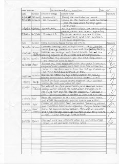
Edit Log.
I have kept an edit log sheet which details all the dates and length of time I have filmed, and edited my trailer. This is only a brief and cursory document of my editing, however it will help me keep track of what I have done and when. It will also help me when it later comes to evaluating my work.
Friday, 26 March 2010
Teaser Trailer.
My main trailer only lasts one minute; therefore I decided to create a teaser trailer. I had not planned to create one and I did not record new footage for my teaser trailer because it was a spare of the moment idea. I have used some footage that I did not use in my main trailer and also re used some. I only used the “Rebirth” song throughout my teaser trailer so that it has a fast pace throughout the whole thing. My teaser trailer only lasts a total of 0.32 so I therefore had to try and make sure it reflected my film in a very short amount of space. I also had to make sure that audiences would be able to pick up on the narrative of my film despite creating this trailer in a short amount of time. I feel that this trailer works very well considering the time space I had to create it. My teaser trailer is not as strong and doesn’t feature as many conventions as my main trailer however I have tried to use as many codes and conventions as I could.
Main trailer.
This is my main trailer for my film “Evanescence”. It lasts a total of 1.00, throughout my research I realised that most horror trailers were a lot shorter than other genre trailers, lasting on average only one minute. The purpose of my trailer is to promote the film and entice my target audience to go and watch it. I have tried to include as many conventions of horror as I can so that my trailer will reach audience expectations and represent the correct genre. Some examples of the conventions I have used are; strong sound track getting faster towards the end, quick paced editing, darkness, suspense, isolated location, creepy “bad guy” and it leaves the audience asking a question.
Wednesday, 24 March 2010
Editing my trailer.
To help make my trailer appear to be more professional I decided to create an end title. I will put it at the very end of my trailer after the film title and as the music cuts out. I created my end title on Photoshop CS3 and stored it on my memory stick ready to put onto the editing suite and onto Adobe Premiere Pro 1.5.
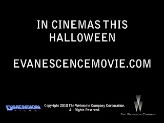
In my trailer I have a title screen with the release date, on my end title I decided to mention again when it is released however rather than giving the date again I have put “In cinemas this Halloween”. It is conventional for trailers to state at the very end of the trailer when the film is coming out but rather than a date, giving a more broad time period, e.g. Coming Soon.
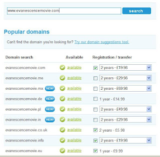
I also put the official film website on my end title, www.evanescencemovie.com. When creating a web address for my website I decided to check the availability of the URL to make sure it wasn’t already an official website. I used http://www.123-reg.co.uk/ to check my URL.
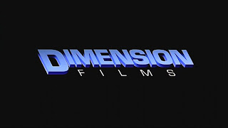
I also included the logos of the production companies of my film and a copyright statement.
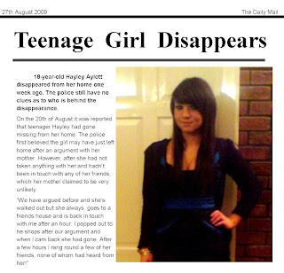
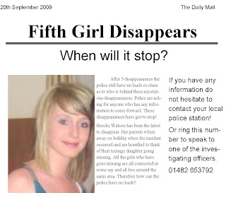
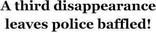
I also created several different headlines for the beginning of my trailer instead of having a news reporter uncovering the information about the disappearances. I decided using headlines would be more effective and will obtain the audiences’ attention and engagement because they will have to concentrate and read the headlines. Here are the headlines and articles I created for my trailer.

In my trailer I have a title screen with the release date, on my end title I decided to mention again when it is released however rather than giving the date again I have put “In cinemas this Halloween”. It is conventional for trailers to state at the very end of the trailer when the film is coming out but rather than a date, giving a more broad time period, e.g. Coming Soon.
I also put the official film website on my end title, www.evanescencemovie.com. When creating a web address for my website I decided to check the availability of the URL to make sure it wasn’t already an official website. I used http://www.123-reg.co.uk/ to check my URL.

I also included the logos of the production companies of my film and a copyright statement.

I also created several different headlines for the beginning of my trailer instead of having a news reporter uncovering the information about the disappearances. I decided using headlines would be more effective and will obtain the audiences’ attention and engagement because they will have to concentrate and read the headlines. Here are the headlines and articles I created for my trailer.


Friday, 19 March 2010
First Edit.
This is the first edit of my trailer. I decided to change several things because I felt that the quality wasn’t good enough and it didn’t flow right. I have kept the beginning with all the newspaper articles the same; however it was before I had made them black and white. The title screens are also the same up to the six disappearances, except they do not have the voice over on. It was after the six disappearances that I decided I needed to change it. The shots where Ashleigh is sat in her living room, looks out the window and the stalker appear are all very dark and do not make much sense. The shot of her sat down is very boring and the shot when the stalker appears needed to be much shorter. I re recorded and changed this entire sequence. After the title “One Secret” my editing needed to be much quicker and a variety of shots needed to be used. At this stage all my shots were medium shots which looked very boring. I needed to use a variety of shots and angles so that it added to the sense of panic and create a faster pace.
Friday, 12 March 2010
Photographs for my magazine.
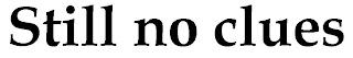
Even though I had decided to use an image for my magazine front cover that included both characters I have also taken some photographs individually.
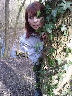
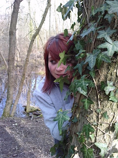
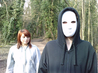
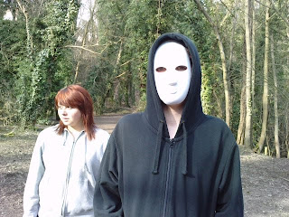
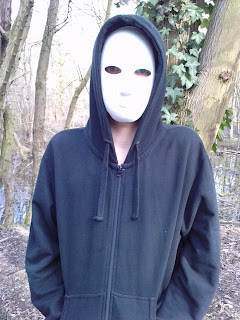
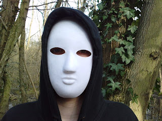
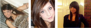
After looking at all of the photographs I had taken I decided I was going to split the image below and have one character on either side of my magazine.

When I stated to manipulate my image on Photoshop I began to experiment with different techniques. I used the lasso tool to cut around the two characters and then layered one on top of the other and blurred the two together.
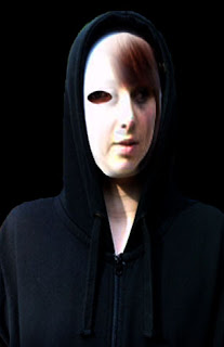
I feel this is a very effective image, it includes both characters, however rather than simply placing one at either side of my magazine cover, it adds an edge to it. The image is very creepy because the two faces now look like one face, half and half. You have to look at the image closely to see that the two faces have been blurred together, however it is very effective and represents the genre of my film.
Tuesday, 9 March 2010
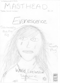
Drafts for my magazine.
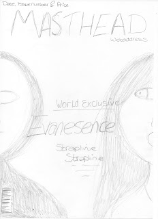
I have designed several drafts for my magazine front cover to help me develop my ideas. When creating my drafts I made sure that all of them used the conventions of magazine front cover. Drawing several different drafts has allowed me to see which layout I would prefer to do. When it comes to creating my final product I can use my chosen draft to help me.
1.
2.
3.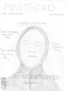
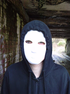
I have decided to opt for draft number one. One of the main conventions of film magazine front covers is to include the main character/s of the featured film. I therefore feel that this will represent my film better because it features both characters. As you can see from my chosen film poster in an earlier blog I decided to just use the mask for my image, so I feel it is important that my magazine features both characters. In order to represent the film my image will feature the actors in costume. All the film magazine front covers I have previously looked at featured the actors as their character and in their costume, this is essential for representation of the film. The magazine is promoting the film; therefore it is important that audiences recognise the actor as a character and the film their character is from.
I will use the “Evanescence” logo that I created in Photoshop (shown on previous blog) as my main headline and place this in between the two characters. It will clearly stand out because it will be in the centre of the page, however I will make sure that the font isn’t as big as the font used for my masthead. I will also place a strapline underneath my main headline to give audiences a clue as to what the featured article is going to be about.
It is important I use colours that are representative of the genre. I must also make sure that the colours have a tangible link to the ones used in my film poster. I will use white and black which links to my film poster; black to represent darkness and white to stand out against the black and reflect the mask. Magazine covers conventionally have three main colours as opposed to two; therefore I will also use the colour red, for my strapline. The colour red represents danger and blood. My background will be black, as mentioned previously this represents darkness but it also means the font and photograph will stand out against it. The masthead and magazine information, date, issue number etc., will be in white so that they stand out.
It is important that my masthead stands out on my page because the masthead is iconic to the magazine. It is always in the same font on every issue; however the colour may change depending on the genre of film being represented. I have thought of several different titles of for my film magazine all of which are words and terminology related to films.
Picture
Reel
Rushes
Exclusive
Montage
Wide Shot
I have decided to call my magazine The Rush because it has several meanings to it; rushes can refer to the first print from a film, before any editing or changes have happened. I feel it would be appropriate for my magazine to have this title as it could suggest that the magazine has the most up to date and exclusive information about films. It could also refer to the rush of excitement you experience when seeing a film at the cinema. I also want the title of my magazine to be technical and when I researched the word rushes I felt this would fit perfectly to my magazine.
I wanted to include a website for the magazine because this is a conventional feature to have on a front cover. Therefore I checked the availability of several websites to see which ones weren’t already actual websites. I used the website www.123-reg.co.uk to check the URL availability, and found that www.thelatestrush.co.uk was not already an official website.

1.

2.

3.

I have decided to opt for draft number one. One of the main conventions of film magazine front covers is to include the main character/s of the featured film. I therefore feel that this will represent my film better because it features both characters. As you can see from my chosen film poster in an earlier blog I decided to just use the mask for my image, so I feel it is important that my magazine features both characters. In order to represent the film my image will feature the actors in costume. All the film magazine front covers I have previously looked at featured the actors as their character and in their costume, this is essential for representation of the film. The magazine is promoting the film; therefore it is important that audiences recognise the actor as a character and the film their character is from.
I will use the “Evanescence” logo that I created in Photoshop (shown on previous blog) as my main headline and place this in between the two characters. It will clearly stand out because it will be in the centre of the page, however I will make sure that the font isn’t as big as the font used for my masthead. I will also place a strapline underneath my main headline to give audiences a clue as to what the featured article is going to be about.
It is important I use colours that are representative of the genre. I must also make sure that the colours have a tangible link to the ones used in my film poster. I will use white and black which links to my film poster; black to represent darkness and white to stand out against the black and reflect the mask. Magazine covers conventionally have three main colours as opposed to two; therefore I will also use the colour red, for my strapline. The colour red represents danger and blood. My background will be black, as mentioned previously this represents darkness but it also means the font and photograph will stand out against it. The masthead and magazine information, date, issue number etc., will be in white so that they stand out.
It is important that my masthead stands out on my page because the masthead is iconic to the magazine. It is always in the same font on every issue; however the colour may change depending on the genre of film being represented. I have thought of several different titles of for my film magazine all of which are words and terminology related to films.
Picture
Reel
Rushes
Exclusive
Montage
Wide Shot
I have decided to call my magazine The Rush because it has several meanings to it; rushes can refer to the first print from a film, before any editing or changes have happened. I feel it would be appropriate for my magazine to have this title as it could suggest that the magazine has the most up to date and exclusive information about films. It could also refer to the rush of excitement you experience when seeing a film at the cinema. I also want the title of my magazine to be technical and when I researched the word rushes I felt this would fit perfectly to my magazine.
I wanted to include a website for the magazine because this is a conventional feature to have on a front cover. Therefore I checked the availability of several websites to see which ones weren’t already actual websites. I used the website www.123-reg.co.uk to check the URL availability, and found that www.thelatestrush.co.uk was not already an official website.

Subscribe to:
Comments (Atom)