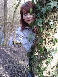
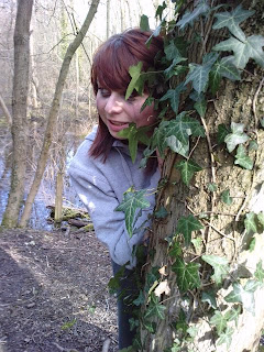
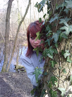
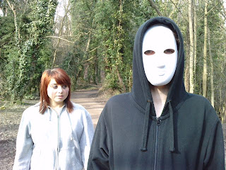
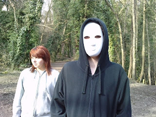
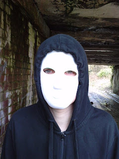
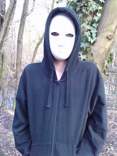
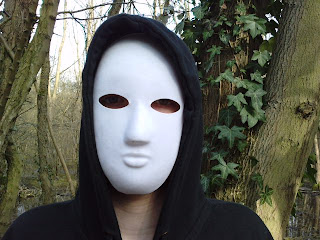
After looking at all of the photographs I had taken I decided I was going to split the image below and have one character on either side of my magazine.

When I stated to manipulate my image on Photoshop I began to experiment with different techniques. I used the lasso tool to cut around the two characters and then layered one on top of the other and blurred the two together.
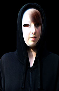
I feel this is a very effective image, it includes both characters, however rather than simply placing one at either side of my magazine cover, it adds an edge to it. The image is very creepy because the two faces now look like one face, half and half. You have to look at the image closely to see that the two faces have been blurred together, however it is very effective and represents the genre of my film.
No comments:
Post a Comment