Friday 23 April 2010

My promotional package.

Main trailer


Teaser Trailer


Film Poster


Film Magazine front cover, featuring the film

Wednesday 21 April 2010

Evaluation.

For my A2 Advanced Portfolio in media I chose the following brief:

A promotion package for a new film, to include a teaser trailer, together with two of the following three options:

• a website homepage for the film;

• a film magazine front cover, featuring the film;

• a poster for the film.

I worked individually on this project and had to make sure I completed the work within the brief. To help me create my work I had to research, plan and develop my ideas to ensure I had been thorough enough before starting to create my products and evaluate them. The task set was a lot more complex than my first year coursework, which was to create a music magazine front cover, double page spread and contents page. My second year coursework involved learning how to use more advanced technical equipment, for example a camera and editing suite. However the work and skills I learned in my foundation portfolio helped me to create my two ancillary texts. I decided to create a film magazine front cover and poster. I did not choose to do a website homepage because I have no prior knowledge about computer design.

When I started my planning and research for my main product I looked at how the media concepts could be applied to my trailer using the acronym “LIIAR”. The language used in my trailer is very important to help it be received by my target audience, and address them in the correct way. The language included is things such as a voice over to help set the equilibrium, or a title sequence. However it was also important that I understood and used the correct language and terminology in all stage of my production; for example, the language of the moving image, medium shots, close ups etc. It was fundamental that I knew the correct terminology and understood what it meant so that I could use the correct elements in my trailer. The institution of my trailer is the production company of my film. I used Dimension Films because they are a well known production company and have produced other horror films such as Amityville Horror, 1408, Scary Movie and all the sequels. The ideology is the ideas, morals and values within my film. The ideology behind my trailer is the main idea of it, e.g. the narrative and making sure it is interesting. However the main idea of my trailer is also to ensure it promotes the film and make the audience want to go and watch the film. The audience for my trailer depended entirely on the genre I chose, I did some audience research and found that my target audience is both males and females aged 15-21. Representation was also a key concept in my production. Everything in my trailer is representation, the characters, the mise-en-scene, cinematography and the editing; all of these elements of my trailer had to represent the genre of horror in order to maintain audience expectations.

After looking at the media key concepts and how they could be applied to my trailer, I decided to research the history of film trailers to help me have a greater knowledge of the background. I felt that building up my knowledge of film trailers would help me when it came to planning my own.

It was important that I used the reception theory to create a preferred understanding. Each individual reads a text differently depending on their circumstances, so there can be major differences between readings of the same code. Therefore by using recognised codes and conventions, and outlining audience expectations on aspects such as genre, there will be an amount of agreement and understanding of what the code means. Hence the importance of thorough research into codes and conventions of existing texts. I analysed several genres of film trailers to see what conventions appeared throughout all trailers. I then decided what genre I wanted my trailer to be and selected to do a horror. After looking at several different genres I personally felt that horror had lots of conventions that would be easy to create in my trailer. I thought it would be difficult to do another genre, just as comedy, because obviously the main convention is humour, which I felt would be difficult to produce and portray because everyone has a different sense of humour. It would be very easy for something that was funny to one person to be the opposite to others.

Once I’d decided on my genre I researched the history of horror films to find out what type of horror has been popular throughout the years. I felt this would help me when it came to planning and developing my ideas as it would allow me what has been successful and what hasn’t. From my previous analysis from across genres I noticed there were several reoccurring elements and conventions such as, end credits, release dates, name of the film, names of actors etc. However to help me find conventions of the representation of the horror genre it was essential I did some more analysis’ but this time focusing completely on horror. When analysing existing horror trailers I looked at four main areas; mise-en-scene, cinematography, editing and sound. Several of the conventions I noticed were; darkness, scary villain or the unknown, a variety of shots and angles to create disorientation, slow paced editing getting faster towards the end with a short montage, dramatic music, sound effects e.g. screaming, and tension/suspense. There were several other conventions but see my earlier posts for more details. To help ensure I used as many of these conventions as possible I started to create a mind map of ideas.

To identify my target audience was very important before I started developing my ideas because I wanted to make sure my trailer would be aimed at the right people. I created a questionnaire and handed it out to a random selection people. I organised all my results into pie charts so that they were clear. I found that my target audience is both male and female aged 15-21; they visit the cinema often as a way of socialising with friends. To help me get a further idea of my target audience I found that the cinema is the preferred way of watching a film instead of at home and buying DVDs is more popular than downloading films. To help me meet audience expectations and reflect the industry, I asked my target audience what aspect of a trailer makes them want to go and watch a film and what elements make a good horror film. My results show that the key factor in making a good horror trailer is suspense and tension; these were reoccurring factors in answer to both questions. Other popular answers were plot, actors/actresses, a twist/the unexpected, believability and a creepy killer/bad guy. My audience research post shows my results and findings in more detail.

When I developed my synopsis and storyboard I used all my findings and results to ensure that I used conventions and expectations of my target audience. I decided that my trailer would have a believable storyline to it because this would add more suspense and tension as audiences are more scared by things that could actually happen, instead of something that could be seen as unlikely to happen, for example, abduction by aliens or possession. I decided that my film would be about disappearances and the mystery behind them. Therefore I used the title Evanescence which means “the event of fading and gradually vanishing from sight”, I felt this would be appropriate title for my film because it links in with my plot, a group of girls who are gradually vanishing one by one with no clues. A convention of a horror is to have a “scary bad guy”; I decided to create a stalker who is behind the disappearances. To make him more conventional I created a stalker that wore a plain white mask. This is intertextual of several previous films; an example of one would be Halloween. A mask is a code for a villain, when audiences see a mask they instantly know the character behind the mask is causing the disruption, whether it is disappearances or murders, because they want their identity to be hidden. I cast my other main character as a teenage girl, this is another convention of horror films, a lot of horror films are based on teenagers getting themselves into deathly situations, an example is Friday the 13th.

Before I started filming I made sure I had a storyboard, script, location, prop and cast list. I also completed a health and safety assessment to make sure any possible hazards could be prevented. I decided to use several locations for my horror trailer. The main one was Little Switzerland which is a public country park on Hessle Foreshore; it has lots of woodland area as well as several railway bridges which I felt would be a perfect location for filming my trailer because it is secluded. The area has lots of different pathways so it was possible to film in various locations. It was important I picked the right location because the mise-en-scene reflects the genre. My location is a convention of horror because a lot of horror films are often in deserted, spooky and remote areas, and Little Switzerland portrayed this perfectly.

I developed a lot of skills when it came to filming; I learned how to use the camera and how to frame a shot. The technical skills required this year have taken a massive leap from the skills required last year. I filmed a total of around 35 minutes worth of footage. I made sure that I re filmed each shot a few times in case it didn’t come out as well as I had hoped the first time. I made sure I filmed in the day because the quality wouldn’t have been very good if I had filmed at night. A convention of horror is darkness, so I therefore made sure that once it came to editing my trailer I darkened all the shots.

I changed my original idea for the opening, instead of having a news reporter disclosing the information about the disappearances and then later having a shot of Ashleigh looking at several newspaper reports, I decided to film different newspaper headlines. I had wanted to create the feeling of a crime scene; Ashleigh is supposed to be the sixth disappearance therefore the news reporter is reporting from outside her house. When I uploaded the footage the dialogue was really quite and the medium close up shot was very boring. So I therefore decided to completely change my opening.

I edited all the newspaper reports together in a sequence, making sure I set the basis up of the narrative, but not giving too much away. I feel the beginning of my trailer is much stronger and more effective than it would have been with my original idea. Having headlines at the beginning of my trailer will help focus the audiences’ attention because they have to read the headlines to help them understand the narrative of the film. I believe the narrative of my trailer has carefully been thought through in order to make sure it makes sense. The newspaper articles at the beginning set up the storyline about the disappearances; however they only state five girls have gone missing. I used a picture of myself in one of the articles so that when Ashleigh is later looking at a photo of herself and me it shows that I am the “One friend” that is referred to in the title sequence. Ashleigh also later goes missing and audiences realise another disappearance is about to happen because one of the title sequences says “Six disappearances”. The last title sequence, “One Secret” leaves audiences asking the question of what is the one secret. This creates suspense.

I used Adobe Premiere Pro 1.5 to edit my trailer, it is a non-linear editing system which made it a lot easier to edit. It allowed me to easily take shots out whenever I wanted to and meant I could edit in a non-linear format. When I was developing my ideas I chose the film score to The Thing as it has a strong dramatic beat to it, I was planning on using this song all the way through, however when I started editing I realised that to follow conventions I needed to later bring in a faster paced song and quicken my editing. I edited the opening of my trailer to The Thing and made sure each shot was in time with the next beat. I feel this gives my trailer a more dramatic atmosphere. When I analysed the existing trailers earlier the sound was a very important element. A trailer would not be complete without a soundtrack or sound effects; therefore I had to make sure my music fitted perfectly with my editing. Making sure each shot was in time with the beat was difficult and took time, however I think the end result of the sound is the strongest element of my trailer. Just before the title sequences finish I started to merge my second song by Hadouken called Rebirth. This song has strong drum and base in it which gives the trailer a dramatic feel. The track is a lot faster than the first one, it speeds the trailer up so I therefore quickened my editing, using lots of short, sharp, cuts in between shots. This is conventional to horror trailers; they speed up and get more dramatic in the second half.

As you can see in a previous blog “first edit” I decided not to use some of the footage that I filmed. I felt a lot of my shots where medium shots and this looked very boring; I wanted to create a montage of quick and disorientated shots. Therefore I re-edited the second half of my trailer and made sure I used different angled shots rather than just using medium shots using other types like close ups. I wanted to use a variety of shots to add speed and disorientation to my trailer. I use lots of quick cuts and fades to create sharper and quicker shots.

When I had finished my editing my trailer together I darkened all the shots, however some of them did not darken as well as I would have hoped, because they were very light in the first place and I didn’t want to darken them too much and loose quality of my video. I have used a voiceover in my trailer which I editing in adobe and added an echo on it to make it sound more dramatic and authoritative.

My final edit uses several conventions of horror trailers; suspense, fast paced editing, dramatic music, creepy bad guy, dark shots, montage, various angles and shots, secluded location and leaves the audience asking a question. I made sure I used appropriate sound, mise-en-scene, editing and cinematography. All of these elements signify to the audience that my trailer is representing the genre of horror. It achieves audience communication by using the reception theory and the preferred reading.

I also did research and planning for my ancillary texts to ensure that I found out what codes and conventions are used within film posters and magazine front covers. I was at an advantage when it came to the magazine front cover as for our foundation portfolio last year we had to create a music magazine. Even though for my advanced portfolio I had to create a film magazine rather than a music magazine, some of the conventions overlap. I learned skills in my foundation portfolio on Microsoft Publisher and Adobe Photoshop CS3 which aided me in my production this year.

For my first ancillary text I created a film poster in Microsoft publisher. From my research and planning I found that the most important element of a horror film poster was a simple but effective picture. Film posters are entirely visual and the picture needs to be effective. The picture will represent the genre and is always the main focal point of a poster. From analysing previous texts I found that the other conventions of film posters are large title, tagline which has to be catchy, two or three main colours which are conventionally dark and credits.

My finished poster is very simple; however it uses all the conventions of horror posters. For the photograph I decided to use a simple shot of the mask. The mask is iconic to my trailer. I wanted a simple but effective image and I thought that a photo of the mask by itself on a dark background would achieve this. I used Photoshop to darken the edges around the mask; I had originally taken the photo on a dark background however it wasn’t as dark as I would have hoped.

I had to make sure that the form and structure of my poster was correct because otherwise it could create an alternate meaning. For example if in my form I had used an image that did not represent horror the poster could be interpreted to be a different genre. Therefore it was essential I followed and used the correct conventions. I had to make sure there was a tangible link between all of my texts; therefore I created the title in Photoshop. Photoshop is an adobe programme and therefore had the same font on it as the Premiere Pro editing suite. I used the same font for my tagline, “You can run, but you can’t hide!” I decided to use this as a tagline because this, along with my image, gives the audience some idea about the narrative of my film. I also decide to create some credits and place them along the very bottom of my poster; they are conventionally the element that is noticed the least on film posters.

For my second ancillary text I had to create a film magazine front cover, featuring my film. I created this in Microsoft Publisher and adapted my photo in Photoshop. I took a photo with both characters in and blurred their faces together. This creates a scary image and looks like one face at first glance until you take a closer look and realise I have blurred the face of Ashleigh with the mask. My research and planning for magazine front covers show that the most important element, like on the posters, is the main image. The magazine is featuring my film therefore it has to be the main focus of the cover.

I decided to call my magazine “The Rush” this can represent the first print from a film, before any editing or changes have happened. I thought it would be appropriate for my magazine as it could suggest that the magazine has the most up to date and exclusive information about films. It could also refer to the rush of excitement you experience when seeing a film at the cinema. I used white font for my title because I wanted it to stand off the dark background. I also made sure I used the same logo that I had used in my previous texts. From my research and planning I discovered that conventionally magazine front covers stick to three colours. I therefore only used three; white, red and black. I used black because it represents darkness, white because it stands out against the black and reflects the white of the mask and red because it represents danger and blood. I had to make sure the magazine front cover represented my film to be a horror, hence my choice of colours.

I had to make sure the form and structure was conventional so that it would signify the right meaning to audiences. The magazine front cover is promoting my trailer so has to communicate the right genre and impression that I want to be received. I therefore added other conventions to the structure of my magazine front cover so audiences can definitely tell that it is a magazine front cover. Some of the other conventions I used where subheadings, barcode, date, issue number and magazine website. I checked the availably of the website “www.thelatestrush.co.uk” at www.123-reg.co.uk.

I made sure that there is a tangible link between all three of my texts to ensure that they work well together as a promotional package. I used dark colours and iconic features so that they will be recognised by audiences. I made sure that the logo of “Evanescence” is used throughout. The mask is the icon of my film and is included within all three texts. I think my three texts are effective in promoting my film. However, I feel my two ancillary texts are not as strong as my trailer. A trailer has so many codes and conventions within different areas, such as sound, whereas, my two ancillary texts had to represent my film through only visual elements. I used all the conventions of both poster and magazines; however I do not feel they are as effective as my main product.

For my audience feedback I created a questionnaire and handed it out to a random selection of people of all ages however made sure I aimed it more at my target audience as it was their opinions and feedback that was of the most interest to me.


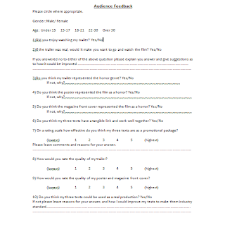
My feedback has been very helpful and has showed me what areas I would need to improve on if I was to do the task again. I got a mixture of positive and negative feedback; however all the negative feedback has suggestions of improvement next to it. Everyone said they enjoyed watching my trailer however not everyone said they would go and watch it as a film. Some people suggested that more needed to be given away as to where the narrative would go, however the majority of people said that the trailer would want to make them go and watch the film if it was real. I asked my audience if they thought my three texts represented the genre of horror, everyone answered yes to my two ancillary texts and the majority said yes to my trailer; however some people said it could be seen as a thriller and suspense instead of a horror. I feel that thrillers and suspense’s closely overlap with horror; there are several features that are the same.

When asked if there was a tangible link between all three texts, everyone answered yes and when asked to rate how effective they thought my three texts where as a promotion package (1 being the lowest) my audience gave an average score of 3.5. I also asked my audience to rate the quality of my film trailer and my two ancillary texts. My trailer scored higher than my two ancillary texts, on average my trailer scored a 4 and my two ancillary texts scored a 3. This has been a very helpful part of my audience research as it has helped me to see that my ancillary texts are the weaker areas.

My final question asked if they thought my three texts could be used as a real production. The majority of people answered no and some of the suggestions left to me were:

• my ancillary texts let me down because they did not look professional enough.

• the quality of my camera when filming needed to be better.

• the editing at the end of my trailer needed to be quicker and include more shots.

Some people left additional comments at the bottom with positive feedback, some of the comments that were left stated how well thought up the narrative of my trailer was and the use of newspaper titles. Another comment left was that the music was a very strong element in my trailer.

I have had to use a lot more media technologies for my advanced portfolio than I did for my foundation portfolio. However some of the skills I gained last year have helped me this year for example my skills on Photoshop, Publisher and blogger. I used all of these media technologies within my productions of both portfolios. My advanced portfolio has required me to use media technologies in all stages. For my research and planning I analysed existing texts for which I used You Tube for existing film trailers. You tube allowed me to stream previous film trailers without having to download them; this made it much easy and quicker to analysis. All of the stages, research and planning, construction and evaluation, have had to be done on blogger. This has been a simple way of keeping my coursework as it has been easy to change things if necessary. However it has been very frustrating to use at times because sometimes it runs slow or on some computers at college it was blocked, making it difficult to access sometimes when needed. For my construction I used various technologies such as a camera, Adobe Premier Pro 1.5, Publisher and Photoshop, all of which I have mentioned previously in my evaluation. By using these programmes it has helped me gain new skills and extend others. All the media technologies have helped me achieve and create my coursework. I feel that if I was to do my advanced portfolio again with the knowledge and experience I have gained from using these technologies I would be at a much better advantage than I was when I started.

Audience expectations have been the most important factor to consider throughout my portfolio. They have helped develop and create my ideas; they have been like rough guidelines of things I need to make sure I included. I feel that I have included all of the conventions and expectations within all three of my texts; however some of them could be improved. For my main product, the trailer, I strongly believe that the sound and mise-en-scene where the strongest elements. I created an original sound track by using two intertextual references to other soundtracks. One is from the film The Thing and my other song is called Rebirth by a band named Hadouken. I feel that both the songs work well together and create different atmospheres. The first one, The Thing, is slow and is played while the narrative builds up, as it does the second song, Rebirth, is brought in and the two are mixed together, until The Thing dies out completely and there is only the fast paced music. However one thing I would say that is letting me down about my sound is the voiceovers. If I was to change anything about the sound I would make the voiceover at the end sound more realistic and scared. Another strong point is the effect my editing has on my sound. I have edited my shots very closely to the music, especially at the beginning which makes my trailer more dramatic and professional because it is edited continuously to the music.

I also feel that I used appropriate mise-en-scene; this form affects the meaning of the trailer. It was important that I used the correct mise-en-scene to represent the genre. I feel that the secluded and isolated feeling of Little Switzerland was the perfect location and mise-en-scene for my trailer. It is conventional for horror films to be set in locations that have these characteristics and I feel I have reflected them well. For example in Friday the 13th, is set in a wood, similar to the location I had chosen.

I feel that the cinematography let me in my main product. Some of the shots did not come out as well as I would have hoped. I believe my ideas for scenes and shots work well together but the outcome is not what I wanted. If I was to redo this portfolio again I would dedicate more time to filming and finding better actors and people willing to follow my directions. I found it difficult to find someone that was willing to create the atmosphere I needed. I needed the main character Ashleigh to look more fearful and dramatic, however because I did not have someone willing to follow my directions exactly I found it difficult to direct the shots. I have made sure that I have used a variety of shots and angles, however if I was to redo my trailer I would use even more variety. I also filmed in the day so that the quality would be better however I did not realise it would be so difficult to darken the shots on Adobe without losing quality. I therefore feel that some of my shots are not dark enough and darkness is a key convention of horror. If light shots are used it could affect meaning and how effective the overall trailer is.

When considering audience expectations within my ancillary texts I have used all the conventions of posters and magazines. However I feel these conventions are not strong enough. I particularly feel that my magazine lets my promotional package down. I think my picture is effective and is conventional because it shows the main characters and when I researched previous film magazine covers all featured films on the cover had an image of the main character. I have also followed the convention of sticking to three colours, however I feel my magazine looks slightly boring and has little colour to it. The subheadings are in red which represents the genre of horror, so even though I have stuck to representation and the convention of sub headings, I feel it could have been improved by using a different font.

I also feel that the font lets me down on my poster and it could be improved. However I had to make sure that there was a clear link between all three texts and the logo was one way in which I achieved this. I had to recreate the title of my film/logo for my magazine and poster on Photoshop and try and match it to the one at the end of my trailer. There was a limited choice on Adobe Premiere Pro 1.5 of fonts and because they were college computers we were not allowed to download fonts and install them into the system. Therefore I had to try and create an appropriate font for the genre of horror. I think the font works well on my trailer but not so well on my ancillary texts.

Overall I feel that my advanced portfolio went well. I have learned and used new skills to create a promotional package for a new film. I have included conventions that are used in the industry within all three texts, to help me achieve audience expectations. I conclude that my trailer is the strongest production out of my three texts; however there are several improvements that could be made, mainly within the area of cinematography. If I was to re-do my advanced portfolio I would improve the ending of my trailer and spend more time trying out different fonts for my three texts so that it would look appropriate on all three. I would also time manage better so that I had more opportunity to critically analyse my own work and make any improvements needed.

Friday 16 April 2010

Magazine front cover, featuring the film.


For my second ancillary text I had to create a film magazine front cover that featured my film. In my foundation portfolio I had to create a magazine front cover so I felt like the skills I learned in the year before would help when creating this magazine front cover. I used the research I had done earlier to help me create this front cover and make sure that it worked well as part of my promotional package.

The image I used includes both characters; it is very creepy because I blurred their two faces to now look like one face, half and half. You have to look at the image closely to see that the two faces have been blurred together, however it is very effective and represents the genre of my film. I made sure that the actors featured where in costume so they represented their character and the genre of the film.

I decided to call my magazine The Rush because it has several meanings to it; rushes can refer to the first print from a film, before any editing or changes have happened. I felt this title would be appropriate for my magazine because it suggests that the magazine has the most up to date and exclusive information about films. It could also refer to the rush of excitement you experience when seeing a film at the cinema. I used the convention of placing my mast head at the top of the page in the largest font because it is important that my masthead stands out on my page because it is iconic to the magazine.

I also included other conventions such as three main colours that represent the genre, a main headline with strapline, subheadings, barcode, magazine website, date, issue number, and price. All of these have helped me create a front cover that reflects the industry by using audience expectations.

Thursday 8 April 2010

Poster advertising the film.


For my first ancillary text I created a poster advertising my film. It had to reflect my trailer in order to work well as a promotional package. The image I chose is iconic to the film and is shown within all three of my texts. I wanted to create a mystery behind the mask, to scare audiences more and keep them in suspense, which is a convention of horror. Suspense was also what my target audience wanted to see within a horror trailer; therefore it is important that I tried to keep this suspense within my two ancillary texts. I placed the mask on a plain back background so that it stands out as much as possible.

At the top of the page I placed the tagline “You can run, but you can’t hide!” because I feel that it gives away clues about the narrative without giving too much away. Audiences will associate the mask to be the “thing” you can’t hide from. It is also catchy and not too long.

At the bottom of my page I used the logo of the film so that it was the same as the font on my trailer. The title of my film is the largest font on the page so that it stands out. I have also created some credits and placed them at the bottom with the production logos at either side. I have tried to use all the codes and conventions of film posters so that my poster reflects my film and the industry.

Saturday 27 March 2010

Edit Log.

I have kept an edit log sheet which details all the dates and length of time I have filmed, and edited my trailer. This is only a brief and cursory document of my editing, however it will help me keep track of what I have done and when. It will also help me when it later comes to evaluating my work.

Friday 26 March 2010

Teaser Trailer.


My main trailer only lasts one minute; therefore I decided to create a teaser trailer. I had not planned to create one and I did not record new footage for my teaser trailer because it was a spare of the moment idea. I have used some footage that I did not use in my main trailer and also re used some. I only used the “Rebirth” song throughout my teaser trailer so that it has a fast pace throughout the whole thing. My teaser trailer only lasts a total of 0.32 so I therefore had to try and make sure it reflected my film in a very short amount of space. I also had to make sure that audiences would be able to pick up on the narrative of my film despite creating this trailer in a short amount of time. I feel that this trailer works very well considering the time space I had to create it. My teaser trailer is not as strong and doesn’t feature as many conventions as my main trailer however I have tried to use as many codes and conventions as I could.

Main trailer.


This is my main trailer for my film “Evanescence”. It lasts a total of 1.00, throughout my research I realised that most horror trailers were a lot shorter than other genre trailers, lasting on average only one minute. The purpose of my trailer is to promote the film and entice my target audience to go and watch it. I have tried to include as many conventions of horror as I can so that my trailer will reach audience expectations and represent the correct genre. Some examples of the conventions I have used are; strong sound track getting faster towards the end, quick paced editing, darkness, suspense, isolated location, creepy “bad guy” and it leaves the audience asking a question.

Wednesday 24 March 2010

Editing my trailer.

To help make my trailer appear to be more professional I decided to create an end title. I will put it at the very end of my trailer after the film title and as the music cuts out. I created my end title on Photoshop CS3 and stored it on my memory stick ready to put onto the editing suite and onto Adobe Premiere Pro 1.5.


In my trailer I have a title screen with the release date, on my end title I decided to mention again when it is released however rather than giving the date again I have put “In cinemas this Halloween”. It is conventional for trailers to state at the very end of the trailer when the film is coming out but rather than a date, giving a more broad time period, e.g. Coming Soon.

I also put the official film website on my end title, www.evanescencemovie.com. When creating a web address for my website I decided to check the availability of the URL to make sure it wasn’t already an official website. I used http://www.123-reg.co.uk/ to check my URL.


I also included the logos of the production companies of my film and a copyright statement.


I also created several different headlines for the beginning of my trailer instead of having a news reporter uncovering the information about the disappearances. I decided using headlines would be more effective and will obtain the audiences’ attention and engagement because they will have to concentrate and read the headlines. Here are the headlines and articles I created for my trailer.


Friday 19 March 2010

First Edit.


This is the first edit of my trailer. I decided to change several things because I felt that the quality wasn’t good enough and it didn’t flow right. I have kept the beginning with all the newspaper articles the same; however it was before I had made them black and white. The title screens are also the same up to the six disappearances, except they do not have the voice over on. It was after the six disappearances that I decided I needed to change it. The shots where Ashleigh is sat in her living room, looks out the window and the stalker appear are all very dark and do not make much sense. The shot of her sat down is very boring and the shot when the stalker appears needed to be much shorter. I re recorded and changed this entire sequence. After the title “One Secret” my editing needed to be much quicker and a variety of shots needed to be used. At this stage all my shots were medium shots which looked very boring. I needed to use a variety of shots and angles so that it added to the sense of panic and create a faster pace.

Friday 12 March 2010

Photographs for my magazine.

Even though I had decided to use an image for my magazine front cover that included both characters I have also taken some photographs individually.


After looking at all of the photographs I had taken I decided I was going to split the image below and have one character on either side of my magazine.


When I stated to manipulate my image on Photoshop I began to experiment with different techniques. I used the lasso tool to cut around the two characters and then layered one on top of the other and blurred the two together.


I feel this is a very effective image, it includes both characters, however rather than simply placing one at either side of my magazine cover, it adds an edge to it. The image is very creepy because the two faces now look like one face, half and half. You have to look at the image closely to see that the two faces have been blurred together, however it is very effective and represents the genre of my film.

Tuesday 9 March 2010

Drafts for my magazine.

I have designed several drafts for my magazine front cover to help me develop my ideas. When creating my drafts I made sure that all of them used the conventions of magazine front cover. Drawing several different drafts has allowed me to see which layout I would prefer to do. When it comes to creating my final product I can use my chosen draft to help me.

1.

2.

3.

I have decided to opt for draft number one. One of the main conventions of film magazine front covers is to include the main character/s of the featured film. I therefore feel that this will represent my film better because it features both characters. As you can see from my chosen film poster in an earlier blog I decided to just use the mask for my image, so I feel it is important that my magazine features both characters. In order to represent the film my image will feature the actors in costume. All the film magazine front covers I have previously looked at featured the actors as their character and in their costume, this is essential for representation of the film. The magazine is promoting the film; therefore it is important that audiences recognise the actor as a character and the film their character is from.

I will use the “Evanescence” logo that I created in Photoshop (shown on previous blog) as my main headline and place this in between the two characters. It will clearly stand out because it will be in the centre of the page, however I will make sure that the font isn’t as big as the font used for my masthead. I will also place a strapline underneath my main headline to give audiences a clue as to what the featured article is going to be about.

It is important I use colours that are representative of the genre. I must also make sure that the colours have a tangible link to the ones used in my film poster. I will use white and black which links to my film poster; black to represent darkness and white to stand out against the black and reflect the mask. Magazine covers conventionally have three main colours as opposed to two; therefore I will also use the colour red, for my strapline. The colour red represents danger and blood. My background will be black, as mentioned previously this represents darkness but it also means the font and photograph will stand out against it. The masthead and magazine information, date, issue number etc., will be in white so that they stand out.

It is important that my masthead stands out on my page because the masthead is iconic to the magazine. It is always in the same font on every issue; however the colour may change depending on the genre of film being represented. I have thought of several different titles of for my film magazine all of which are words and terminology related to films.

Picture

Reel

Rushes

Exclusive

Montage

Wide Shot

I have decided to call my magazine The Rush because it has several meanings to it; rushes can refer to the first print from a film, before any editing or changes have happened. I feel it would be appropriate for my magazine to have this title as it could suggest that the magazine has the most up to date and exclusive information about films. It could also refer to the rush of excitement you experience when seeing a film at the cinema. I also want the title of my magazine to be technical and when I researched the word rushes I felt this would fit perfectly to my magazine.

I wanted to include a website for the magazine because this is a conventional feature to have on a front cover. Therefore I checked the availability of several websites to see which ones weren’t already actual websites. I used the website www.123-reg.co.uk to check the URL availability, and found that www.thelatestrush.co.uk was not already an official website.

Sunday 28 February 2010

Photographs for my Poster.

As I have decided to just feature an image of the mask on its own (see previous post), I have took several photographs on a dark background. I have experimented with the light and different angles to see what makes the photograph more effective.


I decided to use the image above because the angle used it not a direct downwards shot; the angle slightly tilts up towards the mask. However I decided to manipulate my photograph in Photoshop to make the background completely black because the font will stand out better. I also wanted a simple but effective poster and I feel that a black background will help achieve this. Here is my photo after it has been manipulated.


I have also re created the font that is used on my trailer to ensure that the title is in the same font throughout all three texts, it is the logo for my film therefore it is important it is always the same and so that it creates a tangible link. I created it on Adobe Photoshop CS3. It is difficult to see the shadow I created on it because it is on a white background; the shadow is only visible when on a dark background.

Tuesday 23 February 2010

Drafts for my poster.

Below are three drafts I have created for my film poster. It is important to draw some drafts before creating my final product so I can see what conventions should be placed where and have a rough idea of which layout is the most effective.

1)

2)

3)

I have decided to create draft number two. After looking at existing horror posters I have noticed that a simple but effective picture is always used. I feel that by having a poster of just the mask will create suspense and make audiences want to find out who wears the mask. Masks are conventional to horror films and are recognised by audiences that anyone in a horror film wearing a mask is the “bad guy”. Masks hide people’s identities and this is what scares audiences about them. Therefore I want to create a mystery behind the mask, to scare audiences more and keep them in suspense, which is a convention of horror. I think it is essential for the mask to feature throughout all three texts because it is iconic to the film. I will place the mask on a plain back background so that it stands out as much as possible.

To create a tangible link throughout all three texts I must make sure that the name of the film is in the same font that is used on my trailer. This will be the logo of the film. I created my trailer on Adobe Premiere Pro 1.5 therefore I must re create the font on Adobe Photoshop so that it is the same throughout all three texts. The title of my film must be the largest font on the page so that it stands out. Conventionally the title of the film is placed at the top or the bottom of the page so that it does not disrupt the image. I have decided I will place my film title at the bottom of my page underneath my image. I will also make sure that it is central.

Film posters rely on visuals to portray the genre and give audiences some clue as to the narrative if they have not already seen the trailer. The image on its own will not give away many clues about the narrative; therefore I must use a tagline to help represent the film. Taglines are a convention of a poster and become associated with the film. They are usually short and no longer than one sentence long. The shorter and snappier they are the more likely audiences are to remember them and therefore associate it with them film. Several taglines I have thought of for my poster are:

You can run, but you can’t hide!

He is always watching.

Lock your doors.

Don’t look out the window.

Watch your back.

Don’t walk alone.

I have decided to use the first tagline “You can run, but you can’t hide!” because I feel that it gives away the most clues about the narrative; however it does not give away too much. Audiences will associate the mask to be the “thing” you can’t hide from. It is also catchy and not too long. I will place my tagline at the top of the page so that it is noticeable and will stand out; however I will make sure that the font isn’t as large as that used for the title.

I will also create some credits to be featured at the bottom of my poster; this is another convention of film posters. I will place them at the very bottom of the page, underneath the title of the film. The font used for the credits is always faint and does not stand out as much as the rest of the text on the page. The writing is always very small so that it is not clear what it says without looking closely. I will also place the logos of the production companies that produced my film in the two bottom corners of the poster next to the credits.

Friday 19 February 2010

Conventions of film magazine covers.

I have noticed several conventions in film magazine front covers that I must include when creating my magazine front cover to insure that it represents the industry. The conventions are audience expectations and therefore must be included so that my magazine is a success. The magazine front cover has to promote my film, in order to do this I must make sure it correctly represents my film but also make sure it includes magazine conventions so that the magazine will reflect the industry. If my magazine successfully reflects the industry then consumerism will be higher, therefore promoting my film to a larger audience. The main conventions used in a film magazine front covers are:

A masthead. The name of the magazine is always placed at the very top of the magazine and is in a large and bold font. It is the biggest font on the page because it is iconic to the magazine therefore must stand out for audiences to see. The masthead always remains the same, however the colour may vary throughout issues. Sometimes part of the masthead is covered up by the image, this is usually done by successful magazines because it shows that audiences know what the magazine is despite part of the name being covered.

Main headline. This will be a headline about whichever film is being featured on the front cover. It is normally placed over the image and is in large font, however not as large as the masthead.

Strapline. This is placed underneath the headline and gives audiences some indication as to what the article that is featured includes.

Sub-headings. Subheadings are plugs as to what other features are going to appear within the magazine. Some magazine may only include one subheading or perhaps none. However most magazines include two or three, and sometimes place pictures with these subheadings.

Feature photograph. There is always one main image used and this is conventionally an image of the main character/s of the film. The actor or actress that usually appears on the front cover is well known and easily recognised by audiences. They will also represent the film, they will be in a costume that also represents the film rather than casual wear. The actor and costume is an audience expectation as this is convention signifies what genre the film is.

Three main colours. I have noticed that all magazine covers stick to three conventional colours. The colours used on the front cover depend on genre of the film because the colours reflect it. For example a magazine cover featuring a horror film would use dark colours because darkness is a convention of horror. The colour red might also be used because this represents danger and blood. White also represents the horror genre because it reflects the unknown and the mystery.

Other conventions included are, barcode, price, magazine website, date and issue number. All of these are expectations of the audience and help make the magazine reflect the industry because they are expected.

Tuesday 16 February 2010

Textual analysis of existing film magazine covers.

The purpose of film magazines is to promote and inform audiences of upcoming films. The magazines usually review these films to let audiences know if a film is worth going to see or not. Articles on directors, producers and many other aspects of films are also included in film magazines. The magazines are primarily there for entertainment and to inform audiences of new films. I have looked at and analysed several different film magazine front covers to help me create my own.

Entertainment Weekly


Entertainment Weekly is an American magazine and is published by Time, which is a division of Time Warner. The first issue was published in 1990 and circulates an average of 1.7 million copies per week. The magazine is aimed at a more-general audience than other American film magazines, such as The Hollywood Reporter, which is aimed at industry insiders.

The main focal point of the front cover is the image, a medium close up of Johnny Depp as his character Sweeney Todd. This issue of Entertainment Weekly is featuring this film therefore it was important to get an image of the main character on the front so that audiences recognise what film is being featured straight away. Johnny Depp is a successful actor so therefore having him of the front cover makes the magazine seem very successful hence being able to get actors such as Johnny Depp to feature.

The masthead is positioned at the very top of the page and is in large block font in a light blue, which stands out against the grey background. The word “weekly” is incorporated into the word “Entertainment”, this is an icon for the magazine as this is how the masthead has always been presented, however is sometimes in a different coloured font.

The main article of this issue is the “early Oscar contenders”, one of whom is Johnny Depp, hence him being the main image. The headline “Johnny Depp” is in bold white font, which stands out amongst the dark image of Depp and is positioned over the image, in the bottom third of the cover. There are other names of other possible Oscar contenders, these too are in white font, however, it is much smaller. Even though the font is smaller it still stands out because of the colour contrast against the background. “Johnny Depp” is in larger font suggesting that the main focus of the article will be on him and his film Sweeney Todd.

Another conventional feature of the magazine is a plug; this gives the audience an insight into what other articles will be in the magazine. Plugs are conventionally positioned down the side of magazine, with headlines smaller than the main headline. However, the plug on this issue has very large font, the same size as the main headline. “Holiday Movie Preview” is large white font and stands out against the dark background. The number “39” stands out more than the headline because, unlike the rest of the text, the font is light blue. The rest of the headlines are in white apart from this and the masthead. The colour red is also used; it makes the smaller text stand out against the dark background. There are only three main colours used on the front cover, these are blue, white and red. The white and blue represent the cold and harsh character of Sweeney Todd and the red represents blood and danger.


Empire


This front cover is from Empire magazine, which is a British film magazine and was first published in 1989 by Emap. The magazine has a target audience of males and females, ABC, film and cinema fans. The monthly magazine is the biggest selling film magazine in Britain.

Part of the masthead is covered up by the main image; this shows that the magazine is successful as publishers feel confident that audiences will recognise the magazine, despite part of the masthead being hidden. The masthead is in large capital letters, this is so that it stands out as much as possible. The colour red is used to represent danger. This front cover is a lot busier than the previous front cover from Entertainment Weekly that I looked at. There are conventions however that are similar on both covers. Both the mastheads are the largest text on the page and are placed at the top of the magazine.

The main image on this front cover features Heath Ledger staring as The Joker from “The Dark Knight”, his last film. Heath Ledger is a renowned actor; again this shows the magazines success. The image used is a long shot. The image represents Heath’s character to be very intimidating and reflect his character in the film. The costume used is how The Joker appears in the film; he wears bright clothes and has the iconic face paint on. He is sat with his head tilted down and his eyes are looking directly at the camera, his pose and posture add a creepy and eerie characteristic, making audiences feel threatened. Behind him is a metal gate, these could be jail bars representing his dangerous character.

The main headline “Meet The Joker” has a graffiti/comic book style font. This represents the film “The Dark Knight” because Batman was originally a comic strip. All of the front cover has a feel of a comic book, with lots of different colours and fonts. There is a strap line underneath the main headline saying “He’s a cold-blooded, mass-murdering clown”, this font looks like someone has carved it with a knife. This creates a sense of danger and edge. Above the masthead is a strapline, “The Dark Knight World Exclusive!” this gives audiences a taste of what is to appear in the magazine and links with the main headline and image. It also makes the magazine sound more distinguished and exclusive because it says “World Exclusive”. In between the strapline is the Batman logo, this has become an icon and will be easily recognised.

Down the right-hand side are some plugs for other features that are appearing in the magazine. These will pursued audiences to buy the magazine and read the articles inside. They do not disrupt the main image or stop it from being the main focal point of the magazine. The font used for these plugs is smaller than the font used for the main headline. The three main colours used are red, green and purple. The purple and green font matches the clothes that The Joker is wearing. The bright colours represent the comic strip and grab the audiences’ attention. The red used on the masthead represents danger and blood. White is also used for smaller font so that it stands up against the dark background but down not stand out as much as the more important text such as the main headline. Other conventions are also included on the front over, such as the magazine’s website, the issue number, date and price. A barcode is also included in the left-hand corner or the cover.


Total Film


Total Film is Britain’s second-best selling film magazine. It is published by Future Publishing and was launched in 1997. The magazine is published every four weeks.

Total Film’s iconic masthead is similar to that of Entertainment Weekly, because one of the words is incorporated into the other. The word “Film” is in large, white, capitalised font so that it stands out and is the largest font on the page making sure it is the most noticeable. The word “Total” is in a smaller font and is incorporated into the word “Film”; it is the same colour as the background so that it looks like it has been cut out. The word film is larger to put more emphasis on it, because the noun represents the genre of the magazine. Just like the Empire magazine front cover, the masthead is partly covered by the main image.

This issue features the new Sherlock Holmes film. The main image is like the one on the front of the Entertainment Weekly cover, it is a medium shot of Robert Downey Jr. as his character Sherlock Holmes. The image is very simple and doesn’t include any bright colours. As the previous front covers I have looked at, a well know actor has been featured. Robert Downey Jr. is an accomplished actor therefore creates a successful image of the magazine and he will be recognised by audiences.

The main headline lies over the top of the image; “Sherlock Holmes” is in large font in blue and white. The colour scheme of the cover represents the genre and character of Sherlock Holmes. Blue and white represents cool and calmness which is one of the characteristics of Sherlock; it also represents mystery which is an element of the film. The straplines above and below the main headline also reflect the theme of mystery, “All the elements are coming together” and “On set! Cracking the case of the world’s greatest detective”. They also give audiences a clue as to what articles on Sherlock Holmes are going to be included in the magazine. Above the main headline is a box containing the words “World Exclusive”, this is used to make the magazine seem more unique and to make the audience more excited and enticed to buy the issue.

Above the masthead there is a skyline that gives indication as to other top stories and articles that are going to featured in the magazine. The words “10 coolest movies” is in bolder text than the rest of the strapline, this is so these words grab the audiences’ attention to entice them to buy it. The word “coolest” also fits in with the colour scheme and genre. Three small pictures are placed along the top in the skyline to show three of the 10 movies mentioned. This is designed to grab audiences’ attention and make them want to find out what the other movies are.

Down the left and right-hand side of the cover there are plugs to give the audience an insight of further articles and features in the magazine. The same font is used that is used throughout the magazine, in the same blue and white colour scheme. The films mentioned in the side headings are all well known and will be recognised by audiences. They are from a variety of genres, therefore attracting a wider audience. Other conventions that appear on the magazine are a barcode, date, issue number, price and website.

Monday 1 February 2010

Conventions of film posters.

After analysing and deconstructing several different horror posters I have noticed several conventions. I think it is important that I include these conventions as they are expected. By using these conventions within my poster it will help represent the genre of my trailer. It is important that my poster has a tangible link with my trailer and magazine. I am creating a promotional pack, therefore a clear link must be seen and all three texts much represent the same genre. Some of the conventions that I noticed on horror film posters are:

An effective but simple picture. Usually featuring the main character, in the case of horror, the murderer or “bad guy” is normally the image used. This is so that it represents the horror genre, scaring audiences and making them want to go and watch it. The image is always large and covers the majority of the page; this is because it is the main focal point of the poster.

Two or three main colours are used. The colours used for horror are usually dark colours to represent the genre. Colours such as black and greys are used as backgrounds to represent darkness. The font is usually in red or white so that it stands out against the darker background. The colour used depends on what the narrative of the film is about, for example if a film featured a lot of blood and gore the colour red would be used to represent the blood and danger. If a film was about ghosts or the unknown, the colour white might be used to represent this.

Simple font. I have noticed that the fonts used on all horror posters I have looked at have been simple and clear to read, it has never been fancy or over the top. This is so that the font and text does not take the attention away from the main focal point, which is the image.

Large title. The name of the film is always the largest text on the page so that it stands out the most. It is very important the title stands out because the poster is advertising this film and trying to persuade audiences to go and watch it. Therefore the title must be in large font so that it is easily seen by audiences. It is usually placed towards the bottom or the top of the poster, it is rare for the title to be placed in the middle because then it would cover the image. I must make sure that my title is in the same font that I used for my trailer so that there is a link. The title will become the logo for my film therefore making it essential it remains the same throughout.

A tagline. It is difficult to give audiences an idea about the narrative of the film through a poster. A simple image and title does not always give much information, therefore a tagline is used. They are normally short and catchy, and are used to promote the film and give the audience a clue about the narrative. Taglines normally become an icon of the film because if it is catchy the audience will remember it and associate it with the film.

Credits. These are usually placed at the very bottom of the poster underneath the title of the film. They include the names of people that have worked on the film such as directors, producers, etc. Names of the actors will be in larger text if they are well known as this will help promote the film. Sometimes logos of the production companies that have released the film are also included with these credits. The credits are always in a faint font so they do not stand out as much as the rest of the font on the page.

Thursday 28 January 2010

Textual analysis of existing film posters.

The purpose of a film poster is to entice audiences to go and see the film. The poster has to represent the film and its genre and give audiences some clue of what it is about, as they may not have previously seen a trailer. Promotional posters normally include an image of one of the main characters and they must also inform audiences of when the film is released. I have analysed three promotional posters for different horror films to help me see what conventions are used.

An American Haunting


This promotional poster is for horror film “An American Haunting” which was released in 2005. The poster is very simple but effective.

The girl featured on the poster is the main character, Betsy, who is getting haunted by an entity in her house. The image is the main focal point of the poster as it takes up the majority of the space. There are only three colours used on the poster to help keep it simple; black, white and grey/green. These colours represent the genre because they are all dark and dull. A convention of horror films is the darkness. The colour white and grey/green is associated with ghosts, and spirits which relates to the “Haunting” in the title.

The font used for the title is in the colour white and the word “Haunting” fades out along the bottom, again this relates to the theme of ghosts and spirits. The font used is simple and clear, making the image the main focus point. There is also a tagline underneath the film title saying “Possession knows no bounds”. Taglines are used to help promote the film and give audiences more of a clue as to what the film is about, they are normally short, snappy and straight to the point. A symbol of a cross is noticeable on the right-hand side of the page; the narrative of the film is based around possession and exorcism which linked with the idea of the church. The symbol does not stand out straight away however it is a very important part of the poster as it is a symbolic code which will give audiences more clues about the film.

In the top right-hand corner there are the names of several actors and actresses. The same font as the title and tagline is used. Underneath the names of the actors are the credits, these are often very small and difficult to make out. They are not essential for audiences to see but are there for promotional reasons and include the names of producers, directors etc.

Friday the 13th


Friday the 13th was released in 2009 and this is one of the promotional posters for the film.

As the poster for “An American Haunting” there are only three main colours used; black, white and red. The colour black is the main colour used, this is the most conventional colour of horror films as I mentioned previously as it represents darkness and the unknown. As the majority of the poster is in black this makes the red and white stand out more. The font used is, again, simple and clear to read, however it is in bright colours which stand off the poster. Therefore a simple font is appropriate because it makes the bright colours the more important element. The name of the film and the release date are the only things in red, which represents danger and death. The film title “Friday the 13th” is position at the bottom of the page, this is similar to the title of “An American Haunting”. Both titles stand out despite being at the bottom of the page instead of in the centre.

The titles are placed at the bottom of the page because the main image takes central position. The main image is the selling point on a poster, it is important the image is effective and represents the genre of the film as well as giving audiences some clue as to what the narrative of the film contains. The main image on this poster of “Friday the 13th” is of Jason Voorhees, the main character of the film. If someone had not previously seen a trailer this poster would give them some clue as to the main plot of the story. The image shows that Jason is a killer, this is represented through dark colours, a saw and the masks adds a sense of horror as it makes him far more scary and sinister because his face and identity are unknown. The angle used is a low angle shot, this makes audiences feel more inferior because Jason looks very dominating and threatening. Rather than just having an image of the main character, as the promotional poster for “An American Haunting”, the setting is also shown. The background of the image shows part of a wood, this allows audiences to take a guess that the narrative is set around a wood. This is very conventional of a horror film because woods are dark, and isolated, making it the perfect place for Jason to commit his crimes. The tagline also gives some suggestion about the location and setting of the film “Welcome to Crystal Lake”, this suggests that the wood is set around a lake. The white font makes the tagline stand out very clearly at the top of the page, against the dark background.

Along the very bottom of the page is the conventional credits that have also been on previous posters I have looked at. Again the font used for these credits is very small and difficult to make out. The names of production companies, directors etc are all in capital letters and the letter spacing is very close together, this makes it difficult to read. However, if the poster was on a larger scale, for example a billboard, it would be much easier to read the text. These credits are not as important as the main image and title therefore it is essential that they do no stand out too much, taking the attention away from the image and title. There are also different logos underneath the credits, these are the logos of the different production companies that produced and released the film.

Scream


This promotional poster is very simple, like the previous posters I have looked at. Scream was release in 1996 and features classic horror scenes, however isn’t as predictable as everyone expected it to be.

The image is an extreme close up of the main character, Casey, who is trying to solve the murder of her mother. It is a very simple image but grabs the audiences attention. The images shows her facial expression very clearly and relates to the title of the film “Scream”. The image is black and white and is positioned in the centre of the page taking up the majority of the poster. The main focus point of the image is her eyes, they are about two thirds of the page down which is where audiences eyes first glance at. Eyes show emotion, and hers show she is full of fear and shock. The image suggests to audiences that this is how they’ll feel when they watch the film.

As seen previously, this promotional poster uses simple and clear to read font. The title of the film is in white, block writing, which stands out against the dark background. The “M” on scream has a sharp point at the end to represent a knife. The film title is again placed at the bottom of the page, as the titles on the other two posters I have previously looked at. The title of the film along with the image represents the genre of horror however it does not give much away about the narrative. The tagline “Someone has taken their love of scary movies one step too far. Solving the mystery is going to be murder” gives the audience more of a clue about the narrative, it tells them that a murder, or perhaps several, are going to take place and the narrative revolves around solving the murders. However, the poster does not give any clue about who committed the murders, it is usual for film posters to show the main character and in a horror film the murderer is normally the main character.

The promotional poster again conventionally uses three main colours; black, white and gray. It also has the credits and production details along the bottom, as well as the name of the actors and actresses in the film. All this font is in white, sticking to one of the three colours. The logo of the production company, Dimension Films, is also on the poster.